Large photo by Canva. 2 smaller photos by Martha G. Brady. Template by Canva.
Using blocks or strips of color will help you especially in making a reversible backing for a quilt. Choose the colors you want to use. Cut strips that are different widths or use left-overs from past projects. If you tend to use jelly rolls (2 1/2″ wide strips) cut some of them into different widths because you don’t want everything to be the same width. It’s a little more interesting.

Photo by Martha G. Brady
You can do this with Christmas fabrics, but use them in similar Christmas colors such as reds and greens maybe with a pop or two of silver or gold, or a Christmas print. You might prefer more winter colors like blues, white and silvers. You get the idea. Of course, you may be doing totally different colors. The one below is a Fall example with brown, gold and some teal. They are all batiks. You will notice I put in a few pops of bright orange for fun. It doesn’t look like the normal Fall runner, but it works. It also has a beach look as well since those circular teal sections have the look o bubbling water, at least that is what they remind me of,
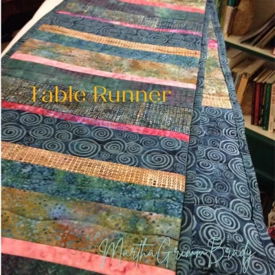
Photo by Martha G. Brady
I learned the hard way, to do this strip design on one side and do a more complex design on the other rather than doing a design on both sides and having the quilting clash. Now I quilt according to the design and don’t have to worry about the strips on the back. They are much more forgiving. When one side has strips of color, it doesn’t natter what the design is on the other side. Plan your quilting according to that design and the back will be fine.
Make sure to use different values of a color in your quilt project. It will make your quilt pop.
When working with color, make sure you choose variations of the color. In other words, don’t pick only one value of a color. It will make the quilt much more boring. Make sure the quilt has a variety of both dark, medium and light values of color to it and that the color is spread around appropriately.
Sometimes, it is difficult to tell for sure if a color is medium or light, especially if it is a print. Squinting can help, but that isn’t always fool-proof. Taking a black and white photo of your colors laid out will tell you the values of your colors every time. With the cameras on our phones, it is very simple.
Color is a huge topic but it has applications to people and to life.
Volumes have been written about color. It is a very interesting topic. But for a blog post, I think I’ll just keep it simple today. I have often said how much I have learned about people and life from quilting. This goes for color as well.
We need more than one kind of person in our lives. It may be easy to have the same kind of person around us. We are naturally drawn to certain people, there is no doubt. But I have learned that just as with color, so it is with people, we need the variety to bring pop to life. The variety in value of color, the variety in color itself, even unpredictability in some of the color combinations bring joy and pleasure to life and pop to a quilt. On that note, I’ll pause to say, “Think about it.”